Reworking the mascot design
For the launch of the website I wanted to rework the site mascot design I had made in 2017, primarily the colors I had used for it. I intended the mascot to be something concrete I could create assets like the favicon and a profile picture out of, that also reflected elements I liked or were related to me. I started by picking out some colors I wanted to use (dark blue, yellow and purple), which I had also tried to base the website design around. I wanted the character to look like a mythical creature or a chimera, having elements from rats, rams and snails/snakes. Beyond that I didn’t put a lot of thought into the design, however, as I quickly sketched something like what I was envisioning and just went with it (including adding random accessories). I put a lot of time into rendering the illustration, but ultimately didn’t like the result much. I used the drawing for my social media avatars, but didn’t actually add it anywhere on the site. I also made a pixel graphic for the favicon in 2018, and just as with the code side of the website I didn’t do anything else with this character until 2021.
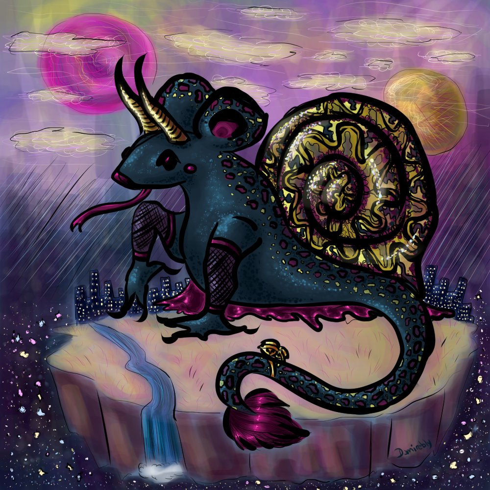
In 2021 as I was picking up development of the site again, I also wanted to take another look at this design. I didn’t like the creature form it had, and made a humanoid/naga version instead using mostly the same elements. I did like a lot of the parts I randomly chose, like the rat ears, the snake body and the curved horns. I loved the way I drew the shell and the colors it had, but I didn’t like it for this humanoid version and so dropped it. I made some minor changes, adding a notch in one of the ears and making the ear interior and sclera have an opalescent gradient. Beyond that change I didn’t reconsider the colors at all, I was still trying to make it work I suppose. I also felt the colors of this design were too saturated and didn’t have enough contrast, and it definitely didn’t work with the much lighter and mellow look of the new site.
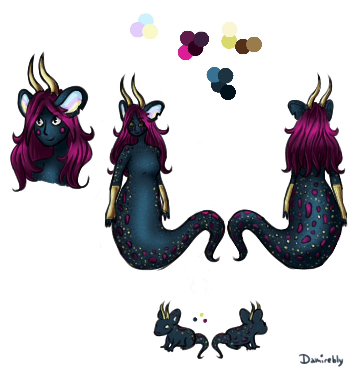
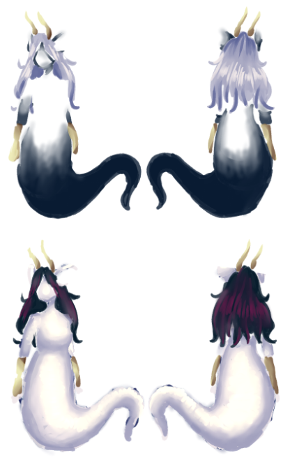
So in 2022 I decided to take a really in-depth pass on the colors. I didn’t want to completely change the color profile, it would still have a purple/blue/pink part, and I was kind of set on having gold detailing (the horns and bracers). But I wanted to experiment with different hues, incorporating more gradients or vary the patterning. I copied up a few versions of the fullbody lineart from the above sheet and started adding colors to them. To try and limit the number of individual figures, I didn’t test every skin variation with every hair variation from the beginning. I did some hair tests on some of them, and then used those same figures to test body patterns. I then narrowed it down to a few I really liked and tested these together, but still left out combinations I didn’t think would work well. I spent a lot of time just dragging a copy of one style of hair around the figures to see what looked good, and vice versa. So there were more variations tried than what I ended up with in the final file.
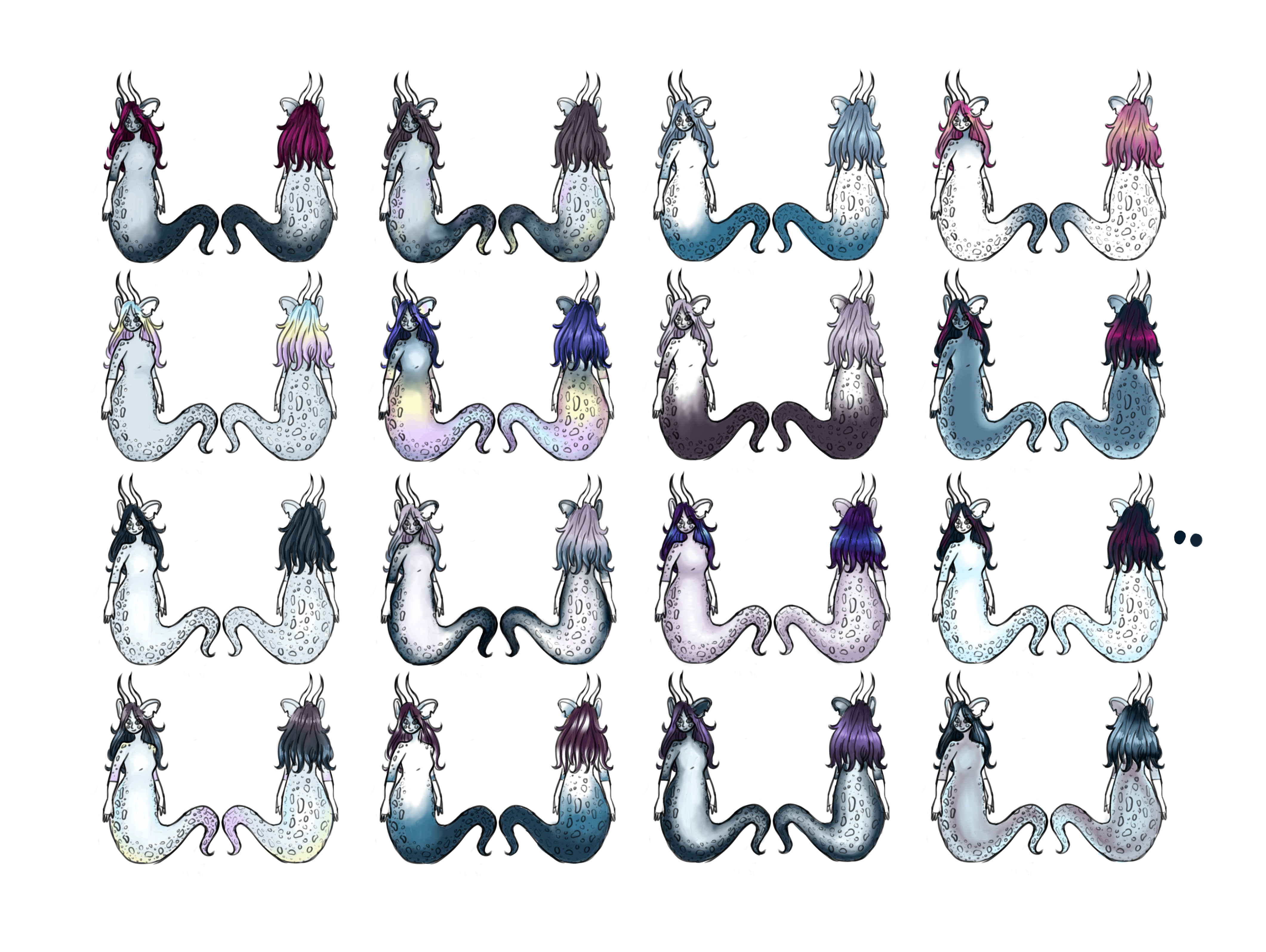
I started with the hues used in the first design and went from there, but was having trouble making it work. Eventually I pulled in colors I had already used in the new website design directly and tried working with those instead (a light purple, light blue and dark blue/teal), and also played around with color correction layers. After filling these first 16 I picked out the ones I thought were most viable and scrapped the rest. For the second pass, as mentioned, I tested more of the combinations together but not all of them.
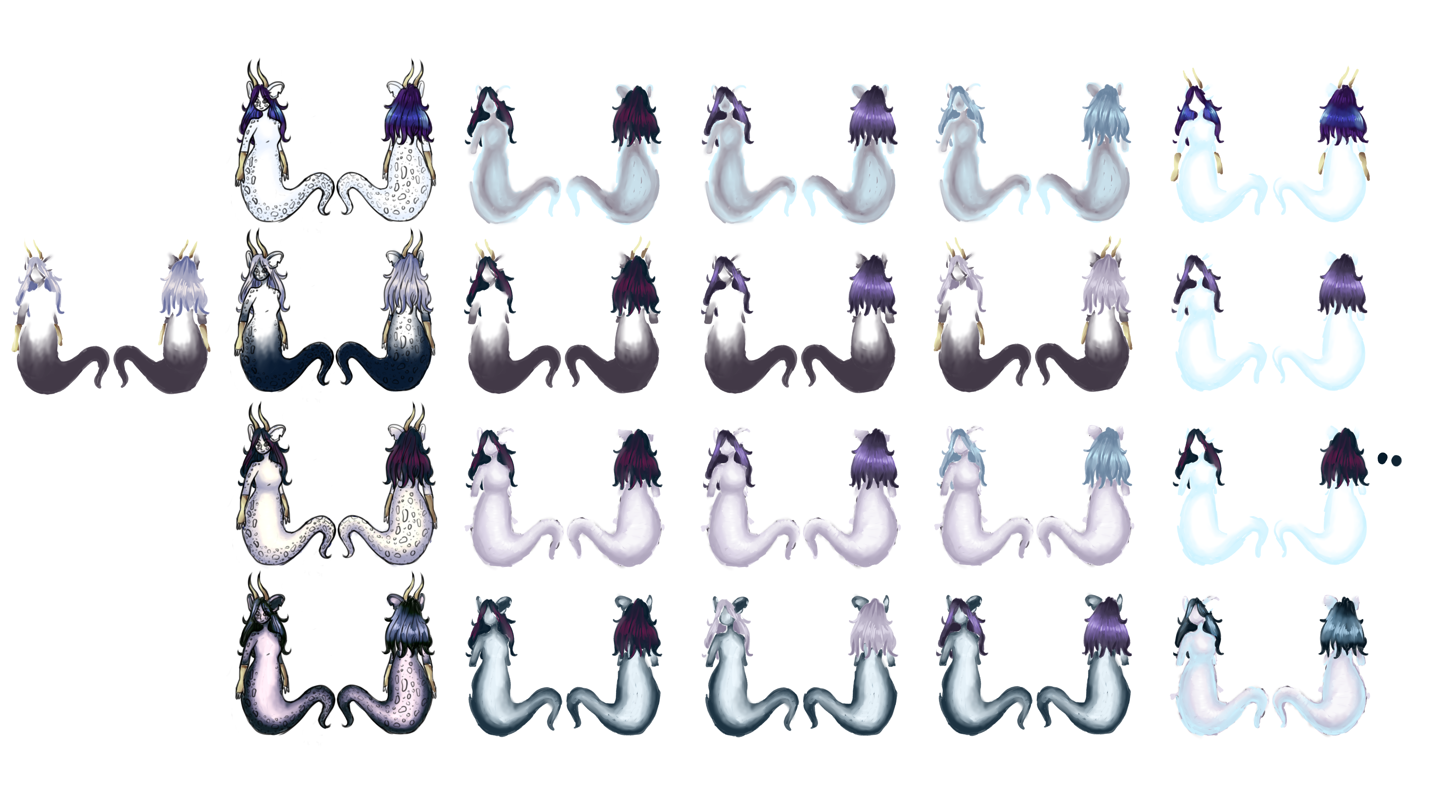
This ended up being really hard to decide. I not only waffled a lot between two-three designs in particular in the end, but struggled to get to those final candidates before that. Shifting the hue and lightness of the colors ended up being key, as I really liked the lavender- and blue-toned hair which was originally just light purple. The skin of the ones I ended up with was also a different color at first (greyish purple -> dark blue/teal). They were shifted separately to get to that end result despite originally being put together randomly on one of the figures.
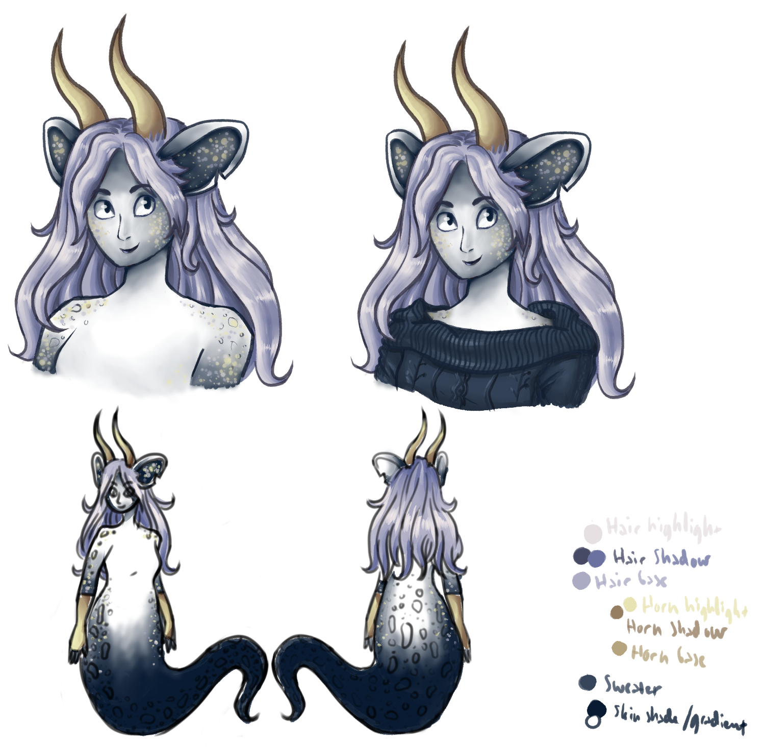
With this base color direction decided I set about remaking the assets (and drawing a new one). There were also some details in the face and ears that I still needed to work out. The interior of the ears was another thing I struggled a bit with working out. I really wanted to use the opalescent look from the previous design, but it didn’t match these new colors. I tried several things before landing on just dark blue with gold spots, kind of like a night sky.
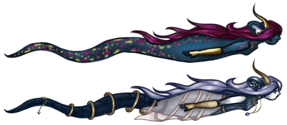
For the profile picture I gave the mascot a cable knit sweater, and wanted to draw a different outfit for the banner image. I never got far enough to give the original design any clothes beyond gloves. I originally drew the image below in 2021 at the same time as the first naga design. For this new version I reused the lineart and redid the colors entirely, and added a fancier outfit than the sweater. Clothes being changeable, I did not try a lot of variations or anything, but added details I felt matched the vibe of the character, like a loose flowing sash, turtleneck tank dress, rings and dangling amulets.
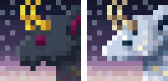
I then redid the favicon. I couldn’t find the CSP file, only the png, so I drew right over it. As a side note, organization of my old website files and assets has been a problem multiple times as I had trouble finding the CSP files for these other images too, as well as any old documentation of when I worked on the old version of the site or even when I started the rework in 2021. That’s more of a problem for the website design and development, as I don’t remember why I made some of the decisions I did and apparently didn’t write it down. At least I couldn’t find my notes from back then. I did eventually find the favicon CSP file, but doing it this way worked fine either way.
With this post I mostly wanted to show off the color variations I did for the test phase, as I ended up liking a lot of the combinations. They just weren’t right for this design. This being just a personal taste choice, I didn’t put a lot of weight into what the colors would represent or anything like that, as I might have if designing for someone or something else. I really like purple and blue together, and wanted to bring in the yellow/gold from the old website. Using these colors more sparingly and in lighter/darker and less saturated tones, broken up by white is much more aesthetically pleasing both for the website itself and this character design. Using dark blue and gold spots also is similar to a starry night sky, which was present in the very first chimera art all this time (though more reddish-purple than blue). I have an idea to draw all these variants together in a scene, and also want to draw more standalone illustrations of this character (along with the old design, which I do still like. I just didn’t like it as the site mascot anymore). But in case that doesn’t come to pass, I at least wanted to showcase these variants somewhere, talk a bit about the process of this redesign and go through the journey of this character’s existence.