Recent blog posts
-
Reworking the mascot design
5 Jan 2023For the launch of the website I wanted to rework the site mascot design I had made in 2017, primarily the colors I had used for it. I intended the mascot to be something concrete I could create assets like the favicon and a profile picture out of, that also reflected elements I liked or were related to me. I started by picking out some colors I wanted to use (dark blue, yellow and purple), which I had also tried to base the website design around. I wanted the character to look like a mythical creature or a chimera, having elements from rats, rams and snails/snakes. Beyond that I didn’t put a lot of thought into the design, however, as I quickly sketched something like what I was envisioning and just went with it (including adding random accessories). I put a lot of time into rendering the illustration, but ultimately didn’t like the result much. I used the drawing for my social media avatars, but didn’t actually add it anywhere on the site. I also made a pixel graphic for the favicon in 2018, and just as with the code side of the website I didn’t do anything else with this character until 2021.
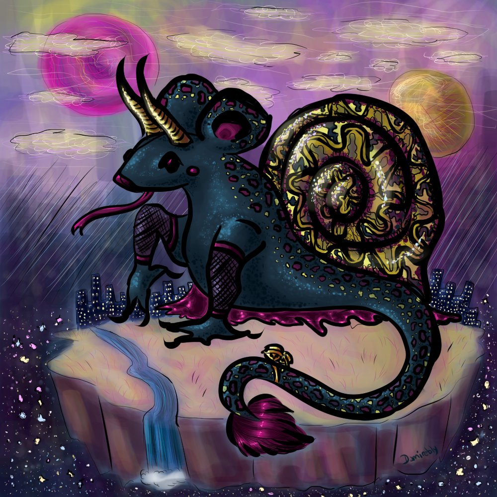
Parts of this I like, both now and at the time, like the background and shell. It didn't really end up having any ram elements in it. In 2021 as I was picking up development of the site again, I also wanted to take another look at this design. I didn’t like the creature form it had, and made a humanoid/naga version instead using mostly the same elements. I did like a lot of the parts I randomly chose, like the rat ears, the snake body and the curved horns. I loved the way I drew the shell and the colors it had, but I didn’t like it for this humanoid version and so dropped it. I made some minor changes, adding a notch in one of the ears and making the ear interior and sclera have an opalescent gradient. Beyond that change I didn’t reconsider the colors at all, I was still trying to make it work I suppose. I also felt the colors of this design were too saturated and didn’t have enough contrast, and it definitely didn’t work with the much lighter and mellow look of the new site.
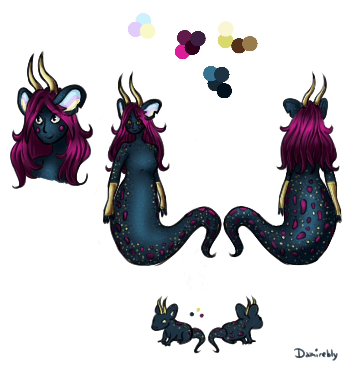
I also made a new cuter creature form, a rat with horns. So in 2022 I decided to take a really in-depth pass on the colors. I didn’t want to completely change the color profile, it would still have a purple/blue/pink part, and I was kind of set on having gold detailing (the horns and bracers). But I wanted to experiment with different hues, incorporating more gradients or vary the patterning. I copied up a few versions of the fullbody lineart from the above sheet and started adding colors to them. To try and limit the number of individual figures, I didn’t test every skin variation with every hair variation from the beginning. I did some hair tests on some of them, and then used those same figures to test body patterns. I then narrowed it down to a few I really liked and tested these together, but still left out combinations I didn’t think would work well. I spent a lot of time just dragging a copy of one style of hair around the figures to see what looked good, and vice versa. So there were more variations tried than what I ended up with in the final file.
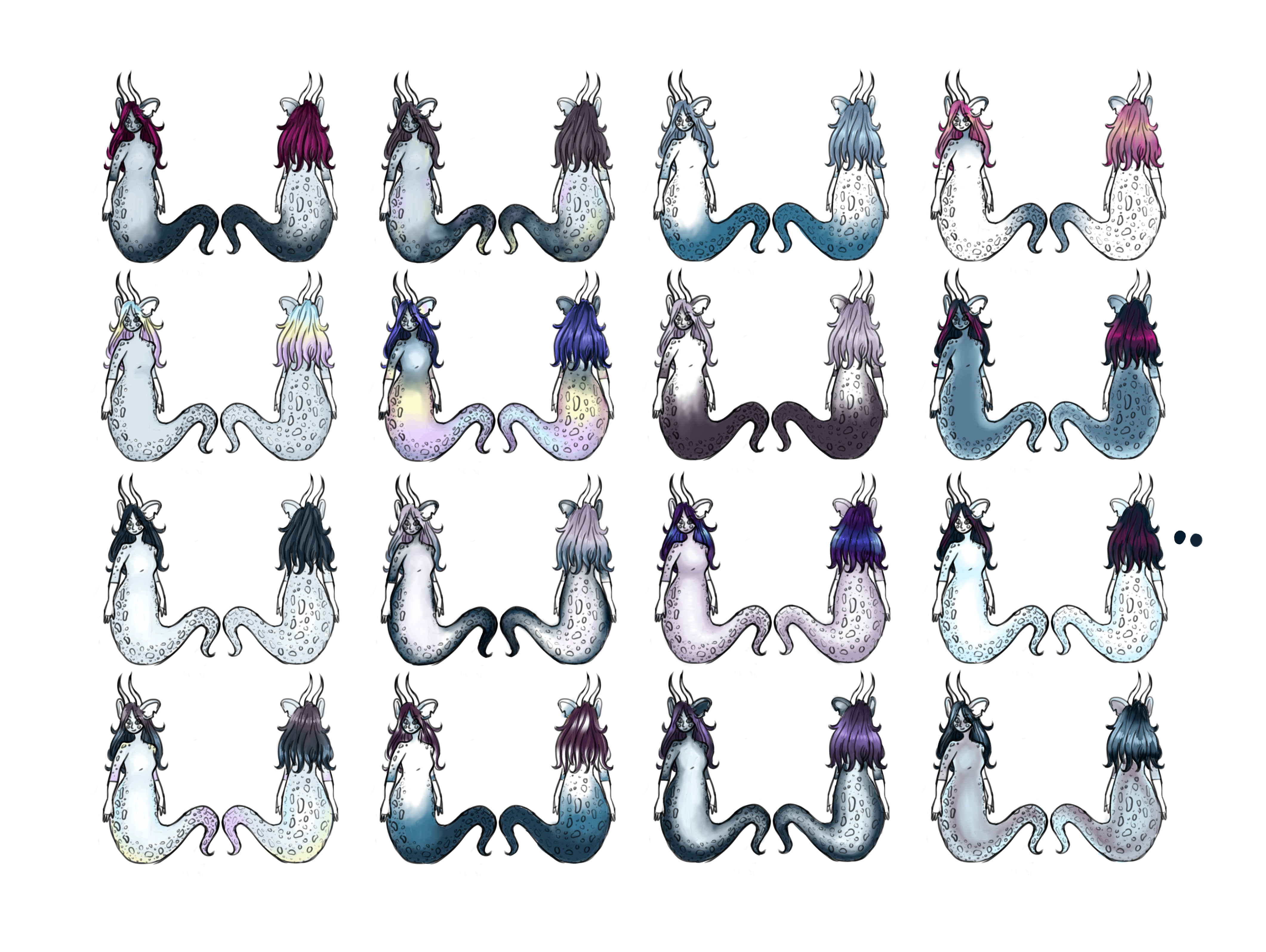
The first pass of this testing round. The original design and lineart had spots on the snake body, but this was something I decided beforehand I didn't really want to carry over in these tests. I tried adding some bigger splotches to one of these to meet the old design in the middle, but didn't like it. I started with the hues used in the first design and went from there, but was having trouble making it work. Eventually I pulled in colors I had already used in the new website design directly and tried working with those instead (a light purple, light blue and dark blue/teal), and also played around with color correction layers. After filling these first 16 I picked out the ones I thought were most viable and scrapped the rest. For the second pass, as mentioned, I tested more of the combinations together but not all of them.
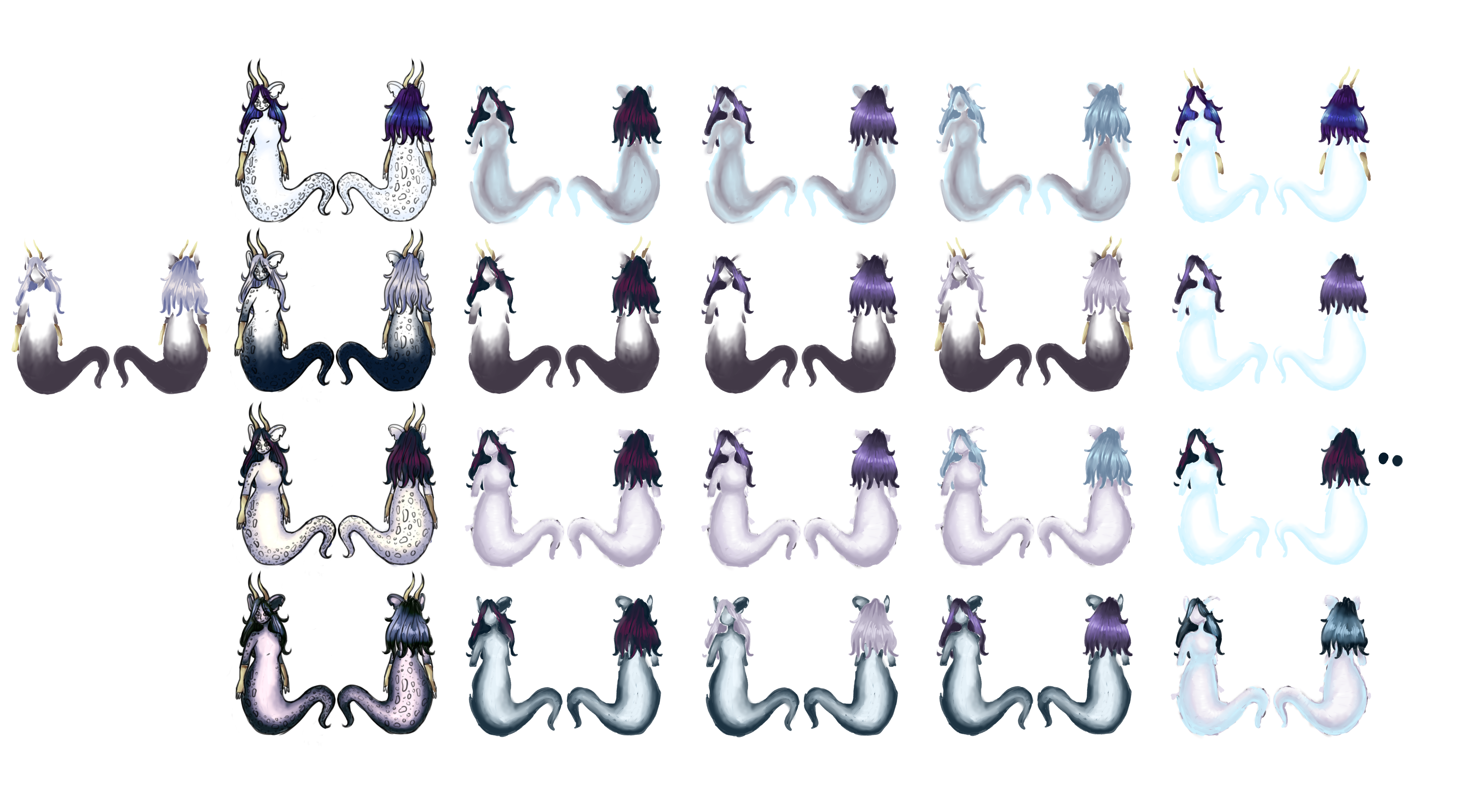
I hid the lineart for most of this second process, as it was getting in the way of evaluating which colors I preferred. I tested the final candidates with the gold accents filled in, as they had to match this as well. This ended up being really hard to decide. I not only waffled a lot between two-three designs in particular in the end, but struggled to get to those final candidates before that. Shifting the hue and lightness of the colors ended up being key, as I really liked the lavender- and blue-toned hair which was originally just light purple. The skin of the ones I ended up with was also a different color at first (greyish purple -> dark blue/teal). They were shifted separately to get to that end result despite originally being put together randomly on one of the figures.
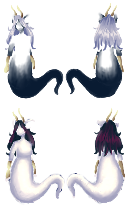
The final two it came down to. I really liked and considered both of these. I finally decided it would be the top one. The bottom design was too similar to the old one, and I was really drawn more to the top color combination. It also matched the site aesthetic better. With this base color direction decided I set about remaking the assets (and drawing a new one). There were also some details in the face and ears that I still needed to work out. The interior of the ears was another thing I struggled a bit with working out. I really wanted to use the opalescent look from the previous design, but it didn’t match these new colors. I tried several things before landing on just dark blue with gold spots, kind of like a night sky.
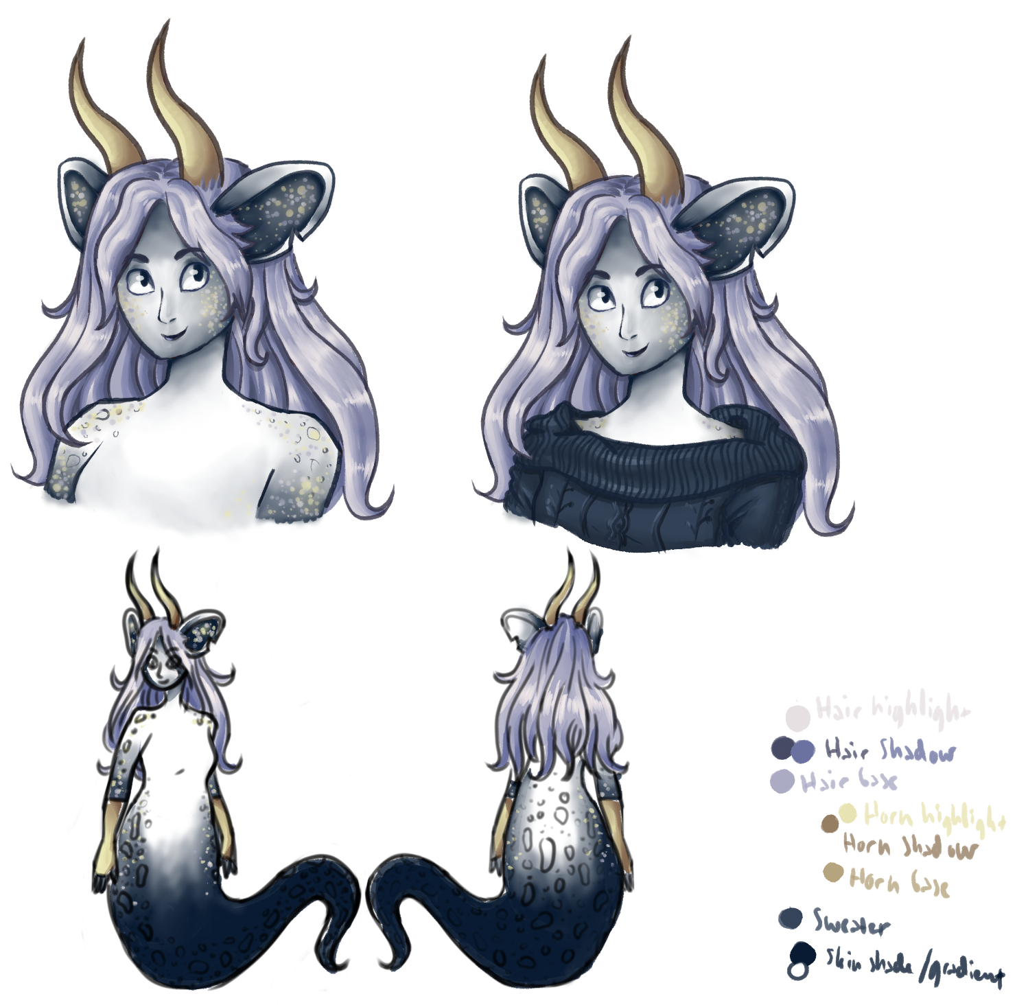
This is the final updated design in sheet form. I went with just plain white for the sclera, not the fancy gradient from the old design. I mostly dropped the big spots that were present on the old design when doing the tests, but tried adding them back in here. I played around with adding lots of bigger gold splotches and glow, but left just this freckling on the upper half of the body as I preferred the tail having a uniform color. For the profile picture I gave the mascot a cable knit sweater, and wanted to draw a different outfit for the banner image. I never got far enough to give the original design any clothes beyond gloves. I originally drew the image below in 2021 at the same time as the first naga design. For this new version I reused the lineart and redid the colors entirely, and added a fancier outfit than the sweater. Clothes being changeable, I did not try a lot of variations or anything, but added details I felt matched the vibe of the character, like a loose flowing sash, turtleneck tank dress, rings and dangling amulets.
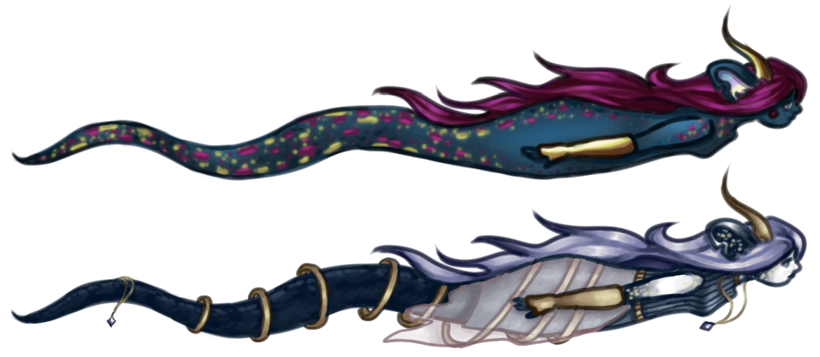
Comparison of the two illustrations. Of this batch of assets I made this is my favorite, I really like how the new version came out. I touched up the lineart a bit, and drew the white outline by hand (for the first one I used the fairy wand tool). I then redid the favicon. I couldn’t find the CSP file, only the png, so I drew right over it. As a side note, organization of my old website files and assets has been a problem multiple times as I had trouble finding the CSP files for these other images too, as well as any old documentation of when I worked on the old version of the site or even when I started the rework in 2021. That’s more of a problem for the website design and development, as I don’t remember why I made some of the decisions I did and apparently didn’t write it down. At least I couldn’t find my notes from back then. I did eventually find the favicon CSP file, but doing it this way worked fine either way.
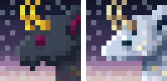
The favicon in a bigger size. I redrew the head slightly too and gave it more detailed shading. With this post I mostly wanted to show off the color variations I did for the test phase, as I ended up liking a lot of the combinations. They just weren’t right for this design. This being just a personal taste choice, I didn’t put a lot of weight into what the colors would represent or anything like that, as I might have if designing for someone or something else. I really like purple and blue together, and wanted to bring in the yellow/gold from the old website. Using these colors more sparingly and in lighter/darker and less saturated tones, broken up by white is much more aesthetically pleasing both for the website itself and this character design. Using dark blue and gold spots also is similar to a starry night sky, which was present in the very first chimera art all this time (though more reddish-purple than blue). I have an idea to draw all these variants together in a scene, and also want to draw more standalone illustrations of this character (along with the old design, which I do still like. I just didn’t like it as the site mascot anymore). But in case that doesn’t come to pass, I at least wanted to showcase these variants somewhere, talk a bit about the process of this redesign and go through the journey of this character’s existence.
-
Launching the site
26 Nov 2022In 2017 I wanted to start taking art and my stories more seriously, with the ultimate goal of making and releasing my own games. With that I decided to make a new artist name for myself, that I felt actually fit me. I’ve had many different usernames before, most of which were randomly chosen at the time with maybe some vague idea behind them. I’ll go over those in a later post, when I write about and showcase some really old art. Anyway, I spent a bit of time making up a new name from elements that were significant to me, as well as a site mascot that could also serve as my profile/face online. The name I landed on was “Damirebly”. It is made up of, basically, 2-3 names I’ve had at some point, with the first part being a new name I wanted to officially take on (“Dami”). So bits of the past, and a bit of the future.
Happy with my choice of name, I set about making a website. I bought the domain in january of 2018, but didn’t do much with it until june that year. I made some assets (a logo and a favicon). I made a very basic page with just HTML and CSS, that had a few of my art pieces on it and links to my social media. I had an unfinished page for my art and writing that was not linked anywhere, so for any potential viewers of the site, the front page was all there was. After that I fell off any further development, and never added any more images, finished the other pages or fixed the layout.
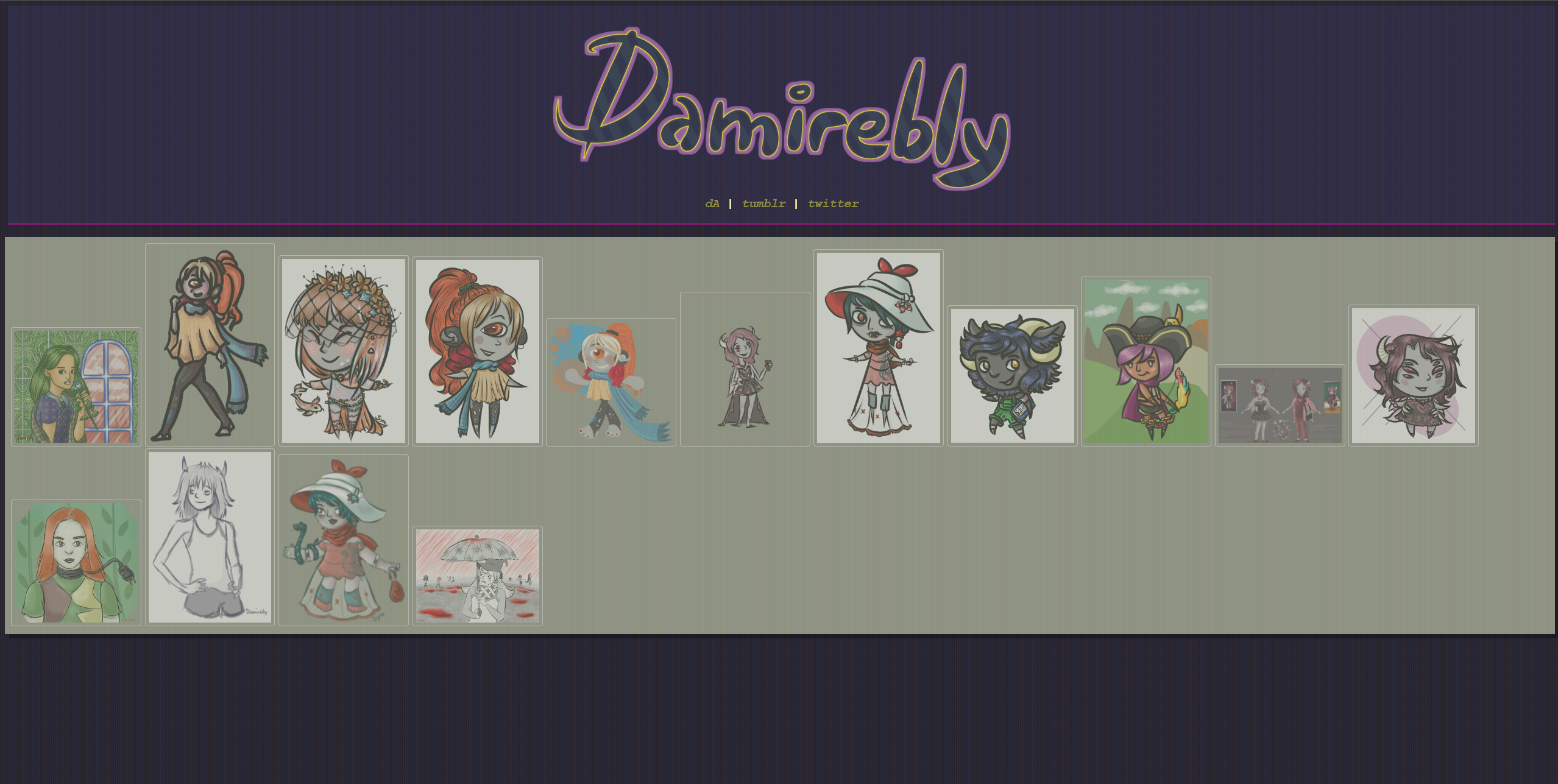
The front page. The website was up like this for nearly 5 years. I also didn’t draw much for a couple years, after having a few very productive months in 2018. I didn’t really pick back up where I left off until 2021, when I tried drawing weekly (didn’t work, but I drew more overall). All this time I often had the thought of fixing up the website, actually doing something with the domain, and trying to get back into drawing. It was one of my yearly goals for each year since 2018. It’s kind of daunting how you can procrastinate something so much it ends up taking years to get started.
In june of 2021 I was going back to school, and had been learning a bit of javascript in preparation. Also in preparation, I thought why not work on the website finally. I had barely logged into my hosting service all these years, and discovered that it had had an overhaul that removed most of the alternatives for website creation. Previously there were many options, like Joomla and Drupal, but now the only options were plain HTML/CSS like I had (and did not want to build a whole website like that) or WordPress. Which I also did not want to use. My plan was always that I would look into these other services to see which one fit me (I still don’t know much about them, maybe they all suck, but at least they were options), now I couldn’t.
I started looking into what alternatives I had for hosting and building a website, now that I could freely pick from anything, since I would need to change hosts anyway. I think I basically googled “static website framework” or something like that. I’m fairly certain this is the site I happened upon: Jamstack Top SSGs, back then. It’s an overwhelming amount of options, and I don’t quite remember why I picked Jekyll out of the bunch. I may have checked out a few and been intrigued by the close connection to GitHub Pages (which I ended up ultimately not using). Either way, I enjoyed learning and using the tool and decided to stick with it.
Development was a little on and off again, I was making progress building the ecosystem for my website, but not working on the design. Development stopped entirely when I began school, and it took another year before I picked it up again. In July 2022 I started by actually creating the design in Figma. I considered the color choices and how I wanted to display my art and posts. I previously tried to use a lot of purple and yellow in my design, and it ended up very dark and muddy. I still kept pops of these colors, but the website has a lot more white and lighter pastel purples now. The design did change a bit as I actually implemented it, with a major reason being that the design was so much bigger than I thought because I had been making it at 50% zoom all that time. So picking out font sizes or sizing elements to match the design made everything comically huge.
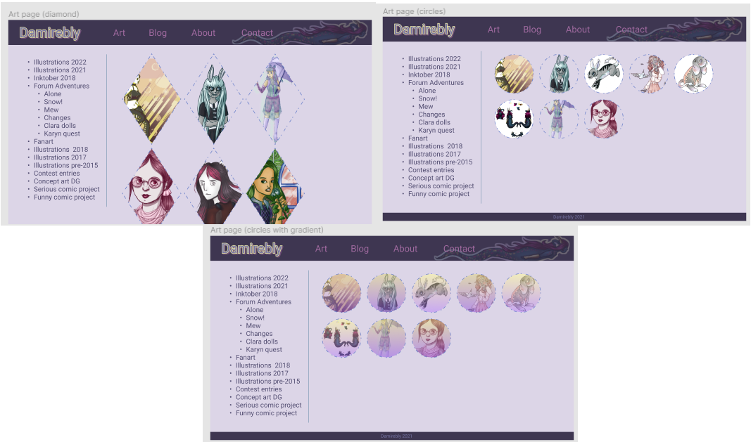
I tried several things for the design before landing where I am now. For instance, at first I considered diamond or circle shapes (with a gradient!) for the thumbnails, but eventually decided that simple squares were better. In November I really started making big strides toward getting the website to a finished enough state to redirect the domain to it. I didn’t want another year of not having completed this goal, and also not pay for a year of hosting with a service I wasn’t going to use. A lot of the functionality was done, and most of the remaining work was design-related. Another thing I did in November was create a new design to be the site mascot/my profile. I wasn’t entirely happy with the first one, even though I liked the design, I felt I could create something more intentional. I’ll write more about that in another post as it was its own little process.
Finally, we are here. This is kind of a soft launch for the website, as not everything is done content-wise (who knew that typing up a bunch of thoughtful descriptions for my own art and descriptive alt text would be tiring). And there may be further hurdles ahead. There is also more functionality I would like to implement down the line. But right now I’m very happy that the site is in the state it is, and look forward to adding more things to it on the other side of publishing it and being done with the previous website.
I have a few more blog posts I want to type up before the year ends, like as mentioned about the site mascot (re)design, and older usernames/art. I may also want to type up a more technical runthrough of how I made this website and the problems I ran into. As well as going more in-depth on the visual design choices I made. But otherwise for the rest of the year I want to focus on making more art, as I’ve put that to the side for a bit in november to focus on finishing the site. Next year a big project will be adding my old forum adventures to be read on the site. This will include writing all the text for them again, with maybe some annotations, as well as a new page design to view the images and read both kinds of text at once. This is another thing I’ve wanted to do for years.
Primarily what I want to do here is keep adding the new art I make (as well as some old art from time to time). Most of my blog posts will probably be updates on the site, and detail new additions or changes as I have a lot I can add over the coming months. I may also want to write some more general things, like about old art projects, things from school, or recommendations. Eventually I will try to realize my dream of making my own games, then those will get progress updates here as well. Anyway, welcome to my new website!
Correction 22.02.23: Year in the first paragraph changed to 2017, previously it said 2018. I realized after writing this that I actually came up with the name and initial mascot BEFORE buying the domain and working on the first version of the site, not all at the same time.